pacman::p_load (igraph,tidygraph, ggraph,
               lubridate, tibble, skimr,
               tidyverse, gganimate,
               jsonlite,SmartEDA, kableExtra,
visNetwork, dplyr, DT)Take-Home Exercise 2
Echoes of Influence: A Visual Analysis of Oceanus

There has been a significant rise in the number of cases in illegal fishing across the world, even in Singapore. Enforcing regulations against illegal, unreported, and unregulated (IUU) fishing has been particularly difficult for authorities, as many operators intentionally use intricate corporate networks spanning multiple countries to conceal ownership and manage their activities.
In this site, we wil be delving into one of the cases of illegal fishing and examine how the data could relate to other cases of illegal fishing
1. Scenario Overview
FishEye International is a non-profit organization that has been dedicated to combating illegal, unreported, and unregulated (IUU) fishing, and this has recently gained access to a global finance corporation’s dataset covering fishing-related enterprises. Drawing from previous investigations, FishEye has found that firms exhibiting irregular or complex organizational structures are significantly more likely to engage in IUU activities or other suspicious operations. Therefore, to support deeper analysis, they have converted the dataset into a knowledge graph containing detailed information on companies, their owners, employees, and financial data. With the available dataset, FishEye now aims to leverage this graph to uncover structural anomalies that could signal IUU involvement.
2 Data Preparation
As part of our Task , we will be making use of our visual analytics packages to identify anomalies in the business groups present in the given knowledge graph.
2.1 Determining the R packages
Before we can kickstart with the data dissemination, we will first need to set up and load the R packages that will be involved in this investigation. The R packages that will be used will be as follows:
igraph: Essential for constructing and analyzing complex networks. It offers tools to compute centrality measures, detect communities, and visualize graphs, which are crucial for identifying influential entities and their connections. Wikipedia
tidygraph: Integrates well with the tidyverse, allowing for tidy manipulation of graph data. It facilitates the analysis of network structures using familiar data manipulation verbs.
ggraph: Built on top of ggplot2, this package is ideal for creating sophisticated and customizable network visualizations, helping to illustrate relationships and hierarchies within the data.
lubridate: Simplifies the parsing and manipulation of date-time data, which is essential for analyzing temporal patterns in communications.
tibble: Provides a framework for working with time series data in a tidy format, enabling the detection of trends and anomalies over time.
skimr : This is to effectively skim out the contents of the json file in a simplified manner. This package is deemed to be much more organised as compared to using the
glimpse()functiontidyverse: A collection of packages including dplyr, tidyr, and ggplot2, which are essential for data cleaning, transformation, and visualization.
gganimate: Extends ggplot2 by adding animation capabilities, useful for visualizing changes in the network over time.
jsonlite: This is used to import the dataset as the dataset is in JSON format instead of the usual excel CSV file
SmartEDA: This is used for performing automated Exploratory Data Analysis (EDA). It simplifies and speeds up the process of understanding the structure and summary characteristics of a dataset.
kableExtra: provides additional customization options for tables created with the knitr package
visNetwork: This is an R package that lets us create interactive network graphs
DT: This is for us to generate any Data Tables
Once these packages are loaded successfully, we are now ready to start to investigate this illegal fishing case.
2.2 Importing and extracting the dataset
Before starting our investigation, let us first import the datasets that will be used to disseminate the data as part of our investigation. The code chunk will be as follows:
MC3 <- fromJSON("data/MC3_graph.json")
MC3_schema <- fromJSON("data/MC3_schema.json")
Before we kickstart on anything, it is best to first see what is inside the content of the json file, and this can be done with the code as shown below:
glimpse(MC3)List of 5
$ directed : logi TRUE
$ multigraph: logi FALSE
$ graph :List of 4
..$ mode : chr "static"
..$ edge_default: Named list()
..$ node_default: Named list()
..$ name : chr "VAST_MC3_Knowledge_Graph"
$ nodes :'data.frame': 1159 obs. of 31 variables:
..$ type : chr [1:1159] "Entity" "Entity" "Entity" "Entity" ...
..$ label : chr [1:1159] "Sam" "Kelly" "Nadia Conti" "Elise" ...
..$ name : chr [1:1159] "Sam" "Kelly" "Nadia Conti" "Elise" ...
..$ sub_type : chr [1:1159] "Person" "Person" "Person" "Person" ...
..$ id : chr [1:1159] "Sam" "Kelly" "Nadia Conti" "Elise" ...
..$ timestamp : chr [1:1159] NA NA NA NA ...
..$ monitoring_type : chr [1:1159] NA NA NA NA ...
..$ findings : chr [1:1159] NA NA NA NA ...
..$ content : chr [1:1159] NA NA NA NA ...
..$ assessment_type : chr [1:1159] NA NA NA NA ...
..$ results : chr [1:1159] NA NA NA NA ...
..$ movement_type : chr [1:1159] NA NA NA NA ...
..$ destination : chr [1:1159] NA NA NA NA ...
..$ enforcement_type : chr [1:1159] NA NA NA NA ...
..$ outcome : chr [1:1159] NA NA NA NA ...
..$ activity_type : chr [1:1159] NA NA NA NA ...
..$ participants : int [1:1159] NA NA NA NA NA NA NA NA NA NA ...
..$ thing_collected :'data.frame': 1159 obs. of 2 variables:
.. ..$ type: chr [1:1159] NA NA NA NA ...
.. ..$ name: chr [1:1159] NA NA NA NA ...
..$ reference : chr [1:1159] NA NA NA NA ...
..$ date : chr [1:1159] NA NA NA NA ...
..$ time : chr [1:1159] NA NA NA NA ...
..$ friendship_type : chr [1:1159] NA NA NA NA ...
..$ permission_type : chr [1:1159] NA NA NA NA ...
..$ start_date : chr [1:1159] NA NA NA NA ...
..$ end_date : chr [1:1159] NA NA NA NA ...
..$ report_type : chr [1:1159] NA NA NA NA ...
..$ submission_date : chr [1:1159] NA NA NA NA ...
..$ jurisdiction_type: chr [1:1159] NA NA NA NA ...
..$ authority_level : chr [1:1159] NA NA NA NA ...
..$ coordination_type: chr [1:1159] NA NA NA NA ...
..$ operational_role : chr [1:1159] NA NA NA NA ...
$ edges :'data.frame': 3226 obs. of 5 variables:
..$ id : chr [1:3226] "2" "3" "5" "3013" ...
..$ is_inferred: logi [1:3226] TRUE FALSE TRUE TRUE TRUE TRUE ...
..$ source : chr [1:3226] "Sam" "Sam" "Sam" "Sam" ...
..$ target : chr [1:3226] "Relationship_Suspicious_217" "Event_Communication_370" "Event_Assessment_600" "Relationship_Colleagues_430" ...
..$ type : chr [1:3226] NA "sent" NA NA ...Before we can start exploring the data set, we will first do some housekeeping on the data by extracting the nodes and links tibble data frames from mc3 tibble dataframe into two separate tibble dataframes called mc3_nodes and mc3_edges respectively, with the codes shown below:
mc3_nodes <- as_tibble(MC3$nodes)
mc3_edges <- as_tibble(MC3$edges)
Once the above is completed, we can now do up the data cleaning, with the codes as shown below:
mc3_nodes <- as_tibble(MC3$nodes) %>%
  mutate(
    id = as.character(id),
    label = as.character(label),
    name = as.character(name),
    type = as.character(type),
    sub_type = as.character(sub_type)
  ) %>%
  distinct()

mc3_edges <- as_tibble(MC3$edges) %>%
  mutate(
    source = as.character(source),
    target = as.character(target),
    type = as.character(type)
  ) %>%
  distinct() %>%
  filter(source != target) %>%
  count(source, target, type, name = "weight")

#write_rds(mc3_nodes, "data/mc3_nodes.rds") --> This is done and run only once
#write_rds(mc3_edges, "data/mc3_edges.rds") --> This is done and run only once
The rds file is R’s way of saving a single R object (like a tibble, list, or model) to our local drive — and later loading it exactly as it was. This is why when I run the write_rds code, I will only run it once. Once that is done then only the rds file will be stored in our project folder, and with that the code chunk below can be executed
mc3_nodes = read_rds("data/mc3_nodes.rds")
mc3_edges <- read_rds("data/mc3_edges.rds")
edges_vis <- mc3_edges %>%
mutate(
from = str_trim(as.character(source)),
to = str_trim(as.character(target)),
label = type
) %>%
select(from, to, label)
# Build nodes directly from edges
nodes_vis <- bind_rows(
edges_vis %>% transmute(id = from),
edges_vis %>% transmute(id = to)
) %>%
mutate(id = str_trim(id)) %>%
distinct(id) %>%
mutate(label = id)Once the stored rds files are read, we can now inspect the data accordingly. As a start, we will first inspect the mc3_edges tibble, with the skim() method used as shown in the code chunk below:
skim(mc3_edges)| Name | mc3_edges |
| Number of rows | 3226 |
| Number of columns | 4 |
| _______________________ | |
| Column type frequency: | |
| character | 3 |
| numeric | 1 |
| ________________________ | |
| Group variables | None |
Variable type: character
| skim_variable | n_missing | complete_rate | min | max | empty | n_unique | whitespace |
|---|---|---|---|---|---|---|---|
| source | 0 | 1.00 | 3 | 33 | 0 | 1052 | 0 |
| target | 0 | 1.00 | 2 | 33 | 0 | 1156 | 0 |
| type | 1022 | 0.68 | 4 | 12 | 0 | 3 | 0 |
Variable type: numeric
| skim_variable | n_missing | complete_rate | mean | sd | p0 | p25 | p50 | p75 | p100 | hist |
|---|---|---|---|---|---|---|---|---|---|---|
| weight | 0 | 1 | 1 | 0 | 1 | 1 | 1 | 1 | 1 | ▁▁▇▁▁ |
So What can we learn from the above?
3,226 connections between nodes are being observed in this data, with 4 columns observed
The
typecolumn has 1,022 missing values, of which 32% of which are edges that do not have the type labelThere are also no duplicate edges as there are no repeated source-target-type rows, so every connection appears only once.
There are maximum character length for both the source and target variables is only 33 characters, so we will not be performing the long text detection check for my case.
2.3 Data Cleaning and Wrangling
The data cleaning process ensures that the mc3_nodes dataset is suitable for network visualization. It converts the id field to character type, removes records with missing or duplicate IDs, and drops the irrelevant thing_collected column. The cleaned output, saved as mc3_nodes_cleaned, provides a simplified and consistent node table for accurate and meaningful graph-based analysis.
mc3_nodes_cleaned <- mc3_nodes %>%
  mutate(id = as.character(id)) %>%
  filter(!is.na(id)) %>%
  distinct(id, .keep_all = TRUE) %>%
  select(-thing_collected)
The next step involves cleaning the mc3_edges dataset to align it with the cleaned node data. This includes renaming the source and target fields to from_id and to_id, converting their values to character type, and filtering out any records where these IDs do not match the id field in mc3_nodes_cleaned. Additionally, Furthermore, data is stored in a new tibble named mc3_edges_cleaned, which ensures consistency and integrity for network graph construction.
mc3_edges_cleaned <- mc3_edges %>%
  rename(from_id = source,
         to_id = target) %>%
  mutate(across(c(from_id, to_id),
                as.character)) %>%
  filter(from_id %in% mc3_nodes_cleaned$id,
         to_id %in% mc3_nodes_cleaned$id) %>%
  filter(!is.na(from_id), !is.na(to_id))
top_ids <- mc3_edges_cleaned %>%
count(from_id) %>%
arrange(desc(n)) %>%
slice_head(n = 200) %>%
pull(from_id)
# Filter edges where either from_id or to_id is in top_ids
edges_subset <- mc3_edges_cleaned %>%
filter(from_id %in% top_ids | to_id %in% top_ids)
# Filter nodes that are referenced in the edge subset
nodes_subset <- mc3_nodes_cleaned %>%
filter(id %in% unique(c(edges_subset$from_id, edges_subset$to_id)))Now that we have filtered the data accordingly, we can now start to prepare our dataset for our visualisation
2.4 Dataset Visualization preparation
First of all we need to prepare the tidygraph first by performing the following steps:
Step 1: Connect our cleaned data first
The following code chunk helps us to prepare our cleaned edge and node data so that it can connect our original edge data (with textual IDs) and the graph representation (with numeric indices), enabling advanced analysis and visualization of communication and influence networks in Oceanus.
This can also be used to build a network graph using tools like igraph, ggraph, or visNetwork. Basically it converts the from_id and to_id fields in the edge list into numeric node indices, a format many graph algorithms and visualizations require.
  node_index_lookup <- mc3_nodes_cleaned %>%
  mutate(.row_id = row_number()) %>%
  select(id, .row_id)

mc3_edges_indexed <- mc3_edges_cleaned %>%
  left_join(node_index_lookup,
            by = c("from_id" = "id")) %>%
  rename(from = .row_id) %>%
  left_join(node_index_lookup,
            by = c("to_id" = "id")) %>%
  rename(to = .row_id) %>%
  select(from, to, type) %>%
  filter(!is.na(from) & !is.na(to))
Why is this step important?
Ensures compatibility with network algorithms like centrality, clustering, or shortest path.
Reduces the risk of errors caused by mismatched or missing node IDs.
This makes the data structure more efficient for graph rendering.
Step 2: Remove any unused nodes and reindex
The next code chunk will help us to remove any unused nodes, reindexes everything, and ensures our edge list aligns cleanly with the updated node list. This is particularly useful for us when preparing for efficient visual or analytical network graph operations, especially when dealing with large or messy datasets.
used_node_indices <- sort(
  unique(c(mc3_edges_indexed$from,
           mc3_edges_indexed$to)))

mc3_nodes_final <- mc3_nodes_cleaned %>%
  slice(used_node_indices) %>%
  mutate(new_index = row_number())

old_to_new_index <- tibble(
  old_index = used_node_indices,
  new_index = seq_along(
    used_node_indices))

mc3_edges_final <- mc3_edges_indexed %>%
  left_join(old_to_new_index,
            by = c("from" = "old_index")) %>%
  rename(from_new = new_index) %>%
  left_join(old_to_new_index,
            by = c("to" = "old_index")) %>%
  rename(to_new = new_index) %>%
  select(from = from_new, to = to_new,
        type)
Step 3: Create a focused subgraph
This step helps us to delve in on the most structurally important players in the Oceanus communication or entity network. This is useful for identifying suspected influencers like Nadia Conti or pseudonym users. The code chunk used is as shown below:
mc3_graph <- tbl_graph(nodes = mc3_nodes_final,
                       edges = mc3_edges_final,
                       directed = FALSE) %>%

  mutate(betweenness_centrality = centrality_betweenness(),
         closeness_centrality = centrality_closeness())

top_nodes <- mc3_graph %>%
  as_tibble() %>%
  filter(betweenness_centrality >= quantile(betweenness_centrality, 0.99, na.rm = TRUE)) %>%
  pull(name)

# Filter graph to keep only those nodes AND edges between them
subgraph <- mc3_graph %>%
  activate(nodes) %>%
  filter(name %in% top_nodes) %>%
  morph(to_subgraph) %>%
  unmorph()
Why is this step important?
Enables sharpened focus by narrowing the scope to the top 1% most critical nodes based on betweenness centrality, the people, vessels, or companies that act as key intermediaries in the network.
Reveals the connections by which Betweenness centrality uncovers nodes that control or influence communication between groups. These nodes may not have the highest number of connections, but they are strategic bridges.
This makes Visualizations Clearer, enabling easier deeper analysis for data analysts
3 Visualising the data set
Now that the tidygraph is set up, we can start to effectively visualize the dataset. We will be doing the visualisation in 3 parts for the easier viewing and understanding.
Part I: Basic Visualisation (Initial EDA)
Now, let us first explore the dataset by first visualizing the distribution of edge records by type. This can be done in 2 ways, with the codes as shown below:
# Prepare edge count by type
edge_summary <- mc3_edges %>%
  mutate(type = ifelse(is.na(type), "Missing", type)) %>%
  count(type, name = "count")

# Plot
ggplot(edge_summary, aes(x = reorder(type, count), y = count)) +
  geom_bar(stat = "identity", fill = "lightblue") +
  geom_text(aes(label = format(count, big.mark = ",")), vjust = -0.5) +
  theme_minimal() +
  labs(
    title = "Count of Relationships by Type",
    subtitle = "Distribution of Edge Records by Relationship Type",
    x = "Edge Type",
    y = "No. of Transactions"
  ) +
  theme(
    axis.title.y = element_text(angle = 0, vjust = 0.5, hjust = 1),
    plot.subtitle = element_text(margin = margin(b = 10))
  ) +
  ylim(0, max(edge_summary$count) * 1.2)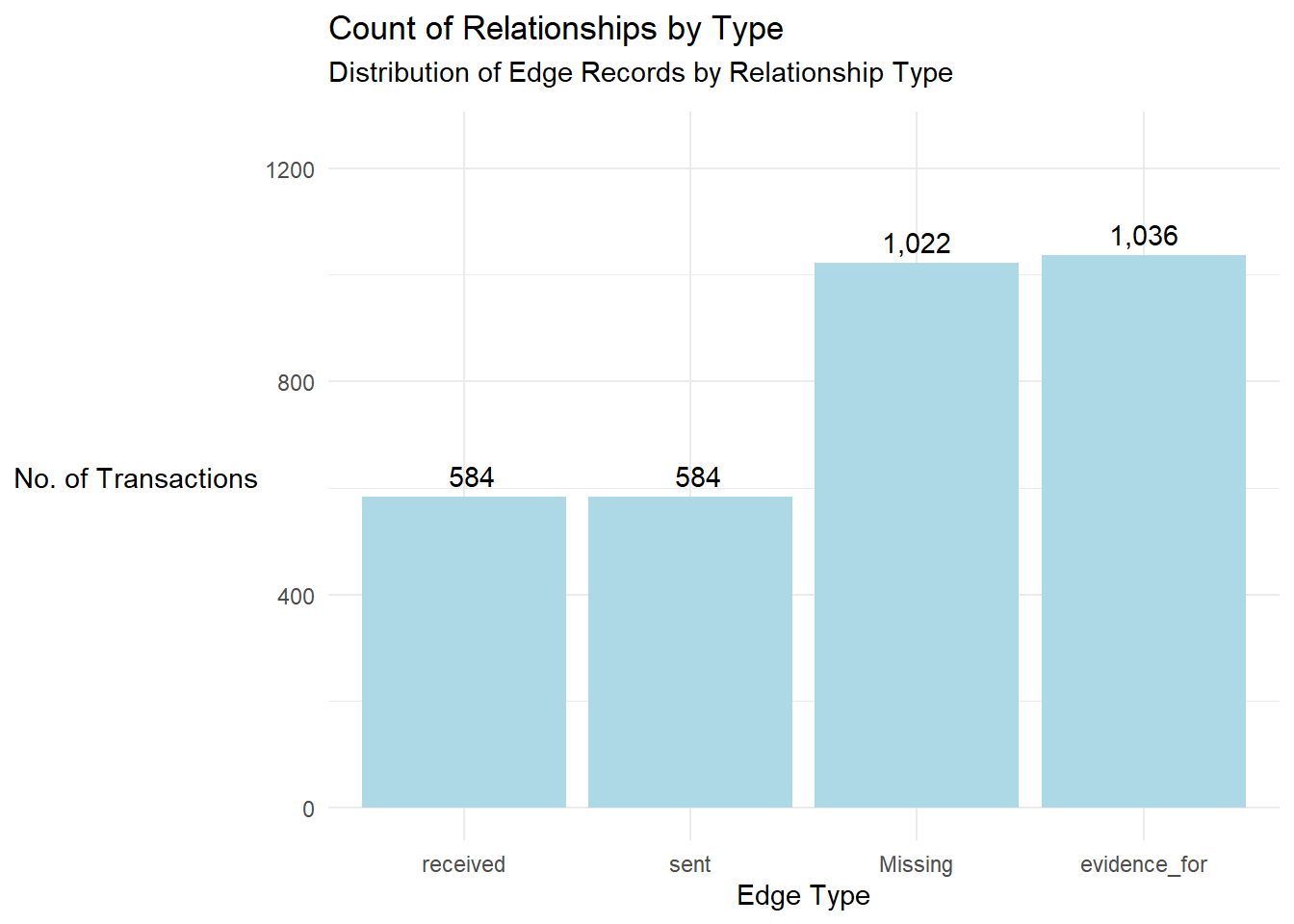
mc3_edges %>%
  mutate(type = ifelse(is.na(type), "Missing", type)) %>%
  count(type, sort = TRUE) %>%
  ggplot(aes(x = reorder(type, n), y = n)) +
  geom_col(fill = "steelblue") +
  coord_flip() +
  labs(
    title = "Distribution of Edge Records by Relationship Type",
    x = "Type of Relationship",
    y = "Number of Edge Records"
  ) +
  theme_minimal()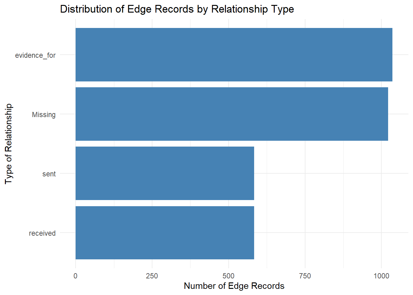
What is the diference between these 2 visualisation methods?
Method 1 does not involve any form of sorting while method 2 ensures that the
reorder(type, count)are arranged in a descending orderMethod 1 involves hardcoding of codes which will take certain time to visualise whilst Method 2 is more efficient
The code below showcases another form of basic visualisation, this time we will visualise more on Oceanus’s hourly communication pattern
communications <- mc3_nodes %>%
  filter(type == "Event", sub_type == "Communication") %>%
  mutate(timestamp = ymd_hms(timestamp),
         hour = hour(timestamp))

ggplot(communications, aes(x = hour)) +
  geom_histogram(binwidth = 1, fill = "#4FC3F7", color = "white", boundary = 0, closed = "left") +
  scale_x_continuous(breaks = 0:23) +
  labs(
    title = "Hourly Communication Pattern on Oceanus",
    subtitle = "Peak activity observed between 08:00 and 11:00",
    x = "Hour of Day (24-hour format)",
    y = "Number of Communications"
  ) +
  theme_minimal(base_size = 13) +
  theme(
    plot.title = element_text(face = "bold"),
    plot.subtitle = element_text(margin = margin(b = 10))
  )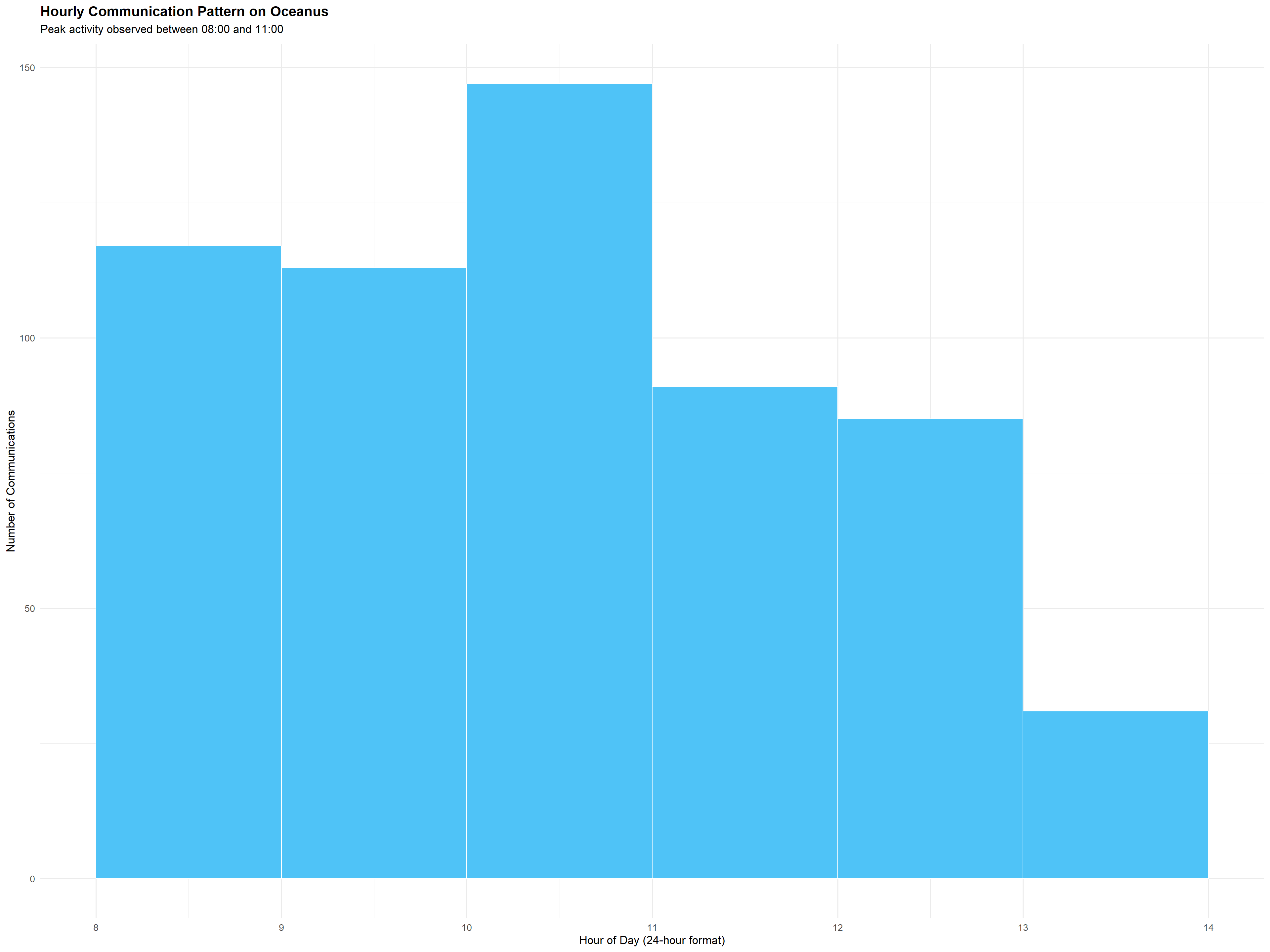
What can we learn from this visualization?
The visualization reveals a strong daily rhythm, which is also known as the clear temporal pattern in communication frequency. Peaking between 8am and 11am, this shows a structured and predictable daily operational cycle of the communications taking place in Oceanus.
The regularity of this pattern offers a baseline for anomaly detection, where any significant deviations such as after-hours communication bursts could serve as red flags.
This temporal view enables proactive decision-making and better allocation of analytic resources, especially when real-time monitoring is considered.
The following code chunk is used to visualize the network graph by showing the top 1% of nodes by betweenness centrality and the direct edges between them. It creates a clean, focused graph that helps highlight the most structurally influential entities within a network.
top_nodes <- mc3_graph %>%
  as_tibble() %>%
  filter(betweenness_centrality >= quantile(betweenness_centrality, 0.99, na.rm = TRUE)) %>%
  select(id, label, type, betweenness_centrality)

top_edges <- mc3_edges_cleaned %>%
  filter(from_id %in% top_nodes$id | to_id %in% top_nodes$id)

nodes_top <- top_nodes %>%
  transmute(id = id,
            label = ifelse(!is.na(label), label, id),
            group = type,
            value = betweenness_centrality)

edges_top <- top_edges %>%
  transmute(from = from_id, to = to_id, label = type)

visNetwork(nodes_top, edges_top, height = "700px") %>%
  visIgraphLayout(layout = "layout_with_fr") %>%
  visOptions(highlightNearest = TRUE, nodesIdSelection = TRUE) %>%
  visLegend()
What can we learn from the above visualisation?
Key Influencers are clearly identified whereby entities such as Neptune, Mako, Nemo Reef, and Oceanus City Council have large node sizes, indicating very high betweenness centrality. These are likely brokers or intermediaries, entities that connect otherwise disconnected parts of the network.
There is no direct connectivity among top Influencers. The lack of visible edges suggests that many of these central nodes are not directly connected to each other. This therefore implies that their centrality comes from being bridges between different parts of the wider network, not from forming a tightly connected cluster.
The visualisation below shows the node distribution based on their sub-type.
mc3_nodes_cleaned %>%
  count(sub_type, sort = TRUE) %>%
  ggplot(aes(x = reorder(sub_type, n), y = n)) +
  geom_col(fill = "#4FC3F7") +
  coord_flip() +
  labs(
    title = "Node Distribution by Subtype",
    x = "Subtype",
    y = "Count"
  ) +
  theme_minimal()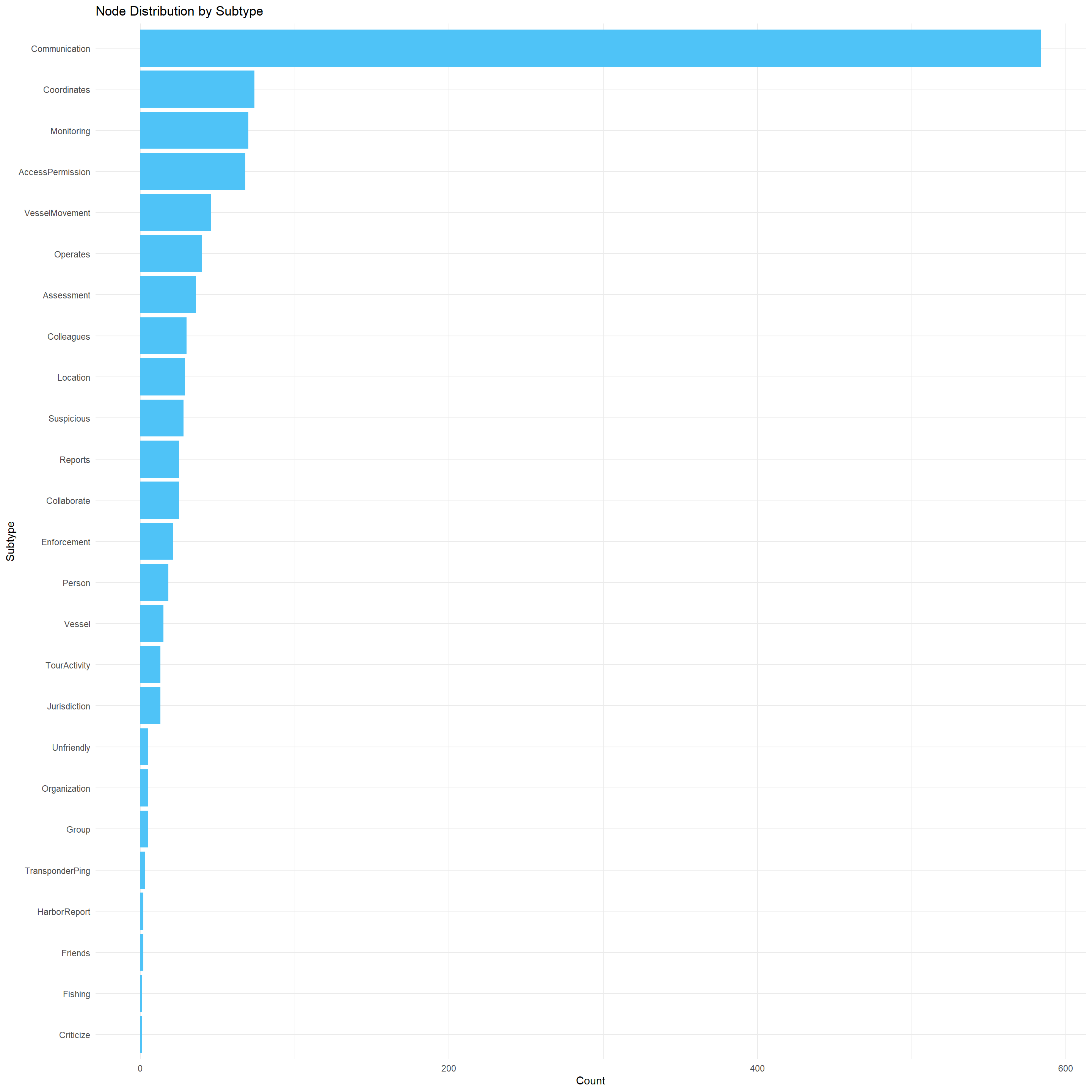
This visualisation is sorted in descending order of frequency. It provides insights into the dominant types of entities or events recorded in the Oceanus knowledge graph.
What can we learn from the above visualisation?
Communication nodes are mostly dominant, with most data recorded in the graph are radio transmissions, intercepted conversations, or message events.
There are subtypes such as
suspicious,JuridictionandFlashing, which suggests that there may be illegal activities detected by the visualisationThere are low frequencies for people, vesels and organisation which implies that the graph above prioritizes event tracking
Part II: Interactive Visualisation
Besides just using graphs like in part I, we can also visualise this dataset by using interactive visualisation to deep dive further into the dataset and justify how the nodes and edges are interconnected. The following are the visualisations which we will uncover:
Visualisation 1: Using the visNetwork package
mc3_nodes_vis <- mc3_nodes %>%
  mutate(id = as.character(id),
         label = coalesce(name, label),
         group = type) %>%
  distinct(id, label, group)

# Prepare edges
mc3_edges_vis <- mc3_edges %>%
  filter(!is.na(source) & !is.na(target)) %>%
  mutate(from = as.character(source),
         to = as.character(target),
         label = type) %>%
  select(from, to, label)

# Create interactive network
visNetwork(mc3_nodes_vis, mc3_edges_vis) %>%
  visIgraphLayout(layout = "layout_with_fr") %>%
  visOptions(highlightNearest = TRUE, nodesIdSelection = TRUE) %>%
  visLegend()
The interactive visualisation uses the visNetwork package as shown above, which can help us to provide a more dynamic and explorable view of the entire knowledge graph structure.
What can we learn from the above visualisation?
The graph reveals distinct clusters of nodes which likely corresponds to groups of people/events/entities that are more densely interconnected, such as project teams, conservation groups, or even Sailor Shift’s crew. These clusters can be starting points for identifying communities or influence groups.
We can make use of the different colors associated with their legends to visually track how events connect entities
We can also easily locate distinct features by using the
select iddropdown menu
Visualisation 2: Interactive Ego
focus_node <- "Nadia Conti"

# Find all connections to/from the node
edges_focus <- mc3_edges_cleaned %>%
  filter(from_id == focus_node | to_id == focus_node)

# Get unique node IDs in this ego network
node_ids <- unique(c(edges_focus$from_id, edges_focus$to_id))

nodes_focus <- mc3_nodes_cleaned %>%
  filter(id %in% node_ids) %>%
  transmute(id = id,
            label = ifelse(!is.na(label), label, id),
            group = type)

edges_focus <- edges_focus %>%
  transmute(from = from_id, to = to_id, label = type)

# Visualize
visNetwork(nodes_focus, edges_focus, height = "600px", width = "100%") %>%
  visIgraphLayout(layout = "layout_with_fr") %>%
  visOptions(highlightNearest = TRUE, nodesIdSelection = TRUE) %>%
  visLegend() %>%
  visLayout(randomSeed = 42)
This interactive visualising network shows all immediate nodes entities, events, and relationships directly connected to Nadia Conti — allowing us to investigate her role and interactions in the Oceanus dataset.
What can we learn from the above visualisation?
We can learn that Nadia is a central connector, and is directly linked to a wide array of Event nodes (yellow), mostly
Communicationevents, and multiple Relationship nodes (red), likeColleagueorInvolved.Most nodes are connected are to
communicationwhich can tell that she has been exchanging lots of messages which can suggest that she is the leader of the fishing teamNadia has diverse communication channels which implies that Nadia is not acting in isolation and she’s embedded in a network of other actors.
Visualisation 3: Interactive Datatable
mc3_nodes_master_updated <- mc3_nodes_cleaned %>%
  mutate(
    countries = str_extract_all(label, "[A-Z][a-z]+"),  # Adjust if you have a proper countries field
    num_countries = lengths(countries)
  )

# Extract top 3 nodes with the most countries
top3_countries <- mc3_nodes_master_updated %>%
  arrange(desc(num_countries)) %>%
  slice_max(num_countries, n = 3) %>%
  select(id, countries, type) %>%
  rename(types = type)

# Display in interactive datatable
datatable(top3_countries,
          options = list(pageLength = 5, scrollX = TRUE),
          rownames = FALSE)
The interactive datatable shown above extracts and displays the top entities from your knowledge graph that are linked to the highest number of unique country-like words within their label fields.
What can we learn from the above visualisation?
There could be potential misuse of entity labels as entities like
Oceanus City CouncilorSailor Shifts Teamare shown to be associated with multiple country-like terms.This table can be used to flag entities that appear unusually widespread, which could signal Entities involved in coordinated international operations and/or Anomalies in labeling or data entry
Part III: Visualising Anomalies
As mentioned and shown above in the data table, there are also anomalies that have been detected in this dataset, and these are shown in the code chunk below:
anomalies <- mc3_nodes_cleaned %>%
  filter(
    duplicated(label) |
    is.na(label) |
    is.na(type)
  )

# Step 2: Filter to monitoring events and clean timestamp
anomalies_filtered <- anomalies %>%
  filter(type == "Event", sub_type == "Monitoring") %>%
  mutate(timestamp = ymd_hms(timestamp, quiet = TRUE)) %>%
  filter(!is.na(timestamp))

# Step 3: Visualise anomalous monitoring activity
ggplot(anomalies_filtered, aes(x = timestamp)) +
  geom_histogram(binwidth = 3600, fill = "#E57373", color = "white") +
  labs(
    title = "Anomalous Monitoring Events Over Time",
    x = "Timestamp",
    y = "Event Count"
  ) +
  theme_minimal()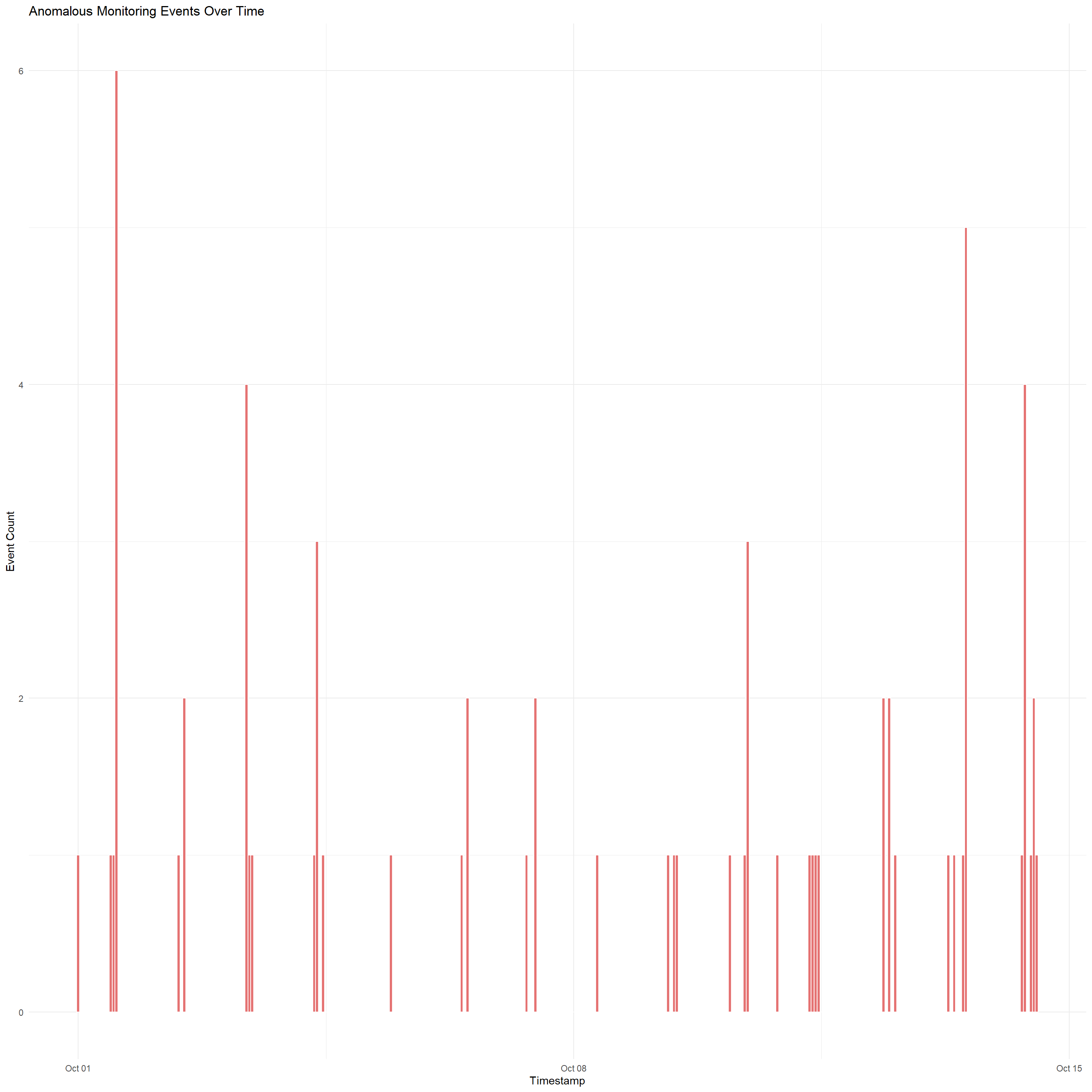
The code chunk and datatable above identifies and visualizes anomalous Monitoring events in the Oceanus dataset by filtering nodes that has a missing type, duplicated label, then based on these anomalies, only nodes of type == "Event" and sub_type == "Monitoring" will be selected
What can we learn from the above anomalies?
There are irregular loading patterns which can indicate that monitoring was manipulated, auto-generated, or deliberately suppressed during specific windows.
There may be undetected data issues caused by the basic
is.na()andduplicated()checksThere are also certain periods of temporal events, such as the spike in Oct 11 and Oct 14 which may indicate that incidents may be happening on those 2 dates
4 Concluding Remarks
Based on this data visualisation, we can now conclude that the Oceanus dataset reveals strong communication patterns, central influencers, and signs of data irregularities. Entities like Nadia Conti show high connectivity, reinforcing suspicions of her involvement in ongoing illicit activities. Anomalous monitoring events—those with missing or duplicated details—appear in bursts over time, suggesting possible data manipulation during key incidents. These visualisations can help us data analysts to uncover things such as hidden patterns, central actors, and irregular logging behaviour, supporting a deeper investigation into corruption and coordinated activity in Oceanus.
References
R-Bloggers. (2021, April 5). 15 essential packages in R for data science. https://www.r-bloggers.com/2021/04/15-essential-packages-in-r-for-data-science/
Wickham, H., François, R., Henry, L., & Müller, K. (n.d.). tibble: Simple data frames. The tidyverse. https://tibble.tidyverse.org/